
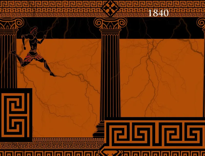
Marathon UI Designer Labels Himself 'Fontslop Merchant', Promises Bungie Won't 'Remove The Sauce From UI'
Bungie's intentionally quirky Marathon UI gets a bold defense as a designer rejects calls for changes, vowing to keep the 'sauce' intact.
Bungie’s Marathon UI: “Weird on Purpose”, And It’s By Design
Gaming’s retro scene just got a spicy update. Bungie, the studio behind Halo and classic Marathon, isn’t here to smooth out every rough edge, especially not when it comes to the UI of its upcoming Marathon revival. In a new interview, the game’s UI designer has leaned into the chaos, labeling himself a “fontslop merchant” and promising Bungie will never “remove the sauce from the UI.”
Let’s break it down. Feedback on early Marathon prototypes has been mixed: some players praise its nostalgic, cluttered charm, while others find the text-heavy, pixel-dense design “unplayable” or “confusing.” But the designer isn’t budging. “This isn’t a bug, it’s a feature,” they told PCGamer. “The ‘sauce’ is that messy, almost chaotic UI we all loved in ’90s shooters. It’s part of the DNA. Stripping it out would be like removing the grit from a vintage arcade cabinet.”
“Fontslop merchant” might sound like a insult, but it’s a badge of honor. The term refers to the intentional use of messy, low-res fonts, overlapping text, and inconsistent spacing, all hallmarks of early 3D gaming when hardware limitations forced designers to prioritize function over polish. “We could make it pretty,” the designer added, “but why? Marathon isn’t just a game; it’s a love letter to how we played before ‘clean UIs’ became a trend. The clunky text? That’s the sound of a developer trying to cram as much info as possible into a screen that could barely handle 320x200 pixels. We’re keeping that energy alive.”
Critics might argue that modern players deserve smoother experiences, but Bungie is doubling down. “Accessibility isn’t about making everything easy, it’s about making sure the soul of the game shines through,” the designer said. “If you want to play Halo with a clean HUD, fine. But Marathon? It’s for the folks who remember squinting at their monitor, trying to read that tiny health bar while a plasma rifle blast fries their pixels. We’re keeping the squint factor.”
For now, the “sauce” stays. Bungie hasn’t announced a release date for Marathon, but the UI debate is already heating up. Will players embrace the chaos, or will “fontslop” prove too much? One thing’s for sure: this isn’t your average polished modern UI. It’s retro, it’s unapologetic, and it’s got a designer who’s ready to defend it, sauce and all.
Whether you love it or loathe it, Marathon is shaping up to be a UI experiment that’s already rewriting the rulebook. And honestly? We can’t wait to squint.
VERWANDTE ARTIKEL

NetEase meldet ECC: Redline als neues MMO an
Der Publisher NetEase Interactive Entertainment hat Marken für ECC: Redline in den USA und Europa angemeldet.

Happy Meal: Pokémon-Karten kehren im November zurück
Eine neue McDonald's-Promotion bringt ab 5. November 2026 wieder Pokémon-Sammelkarten in die Happy Meals der USA, mit 15 Motiven in Vierer-Packs.

Futurama: Drei neue Specials, erstes wird Weihnachtsspecial 2027
Hulu kündigt drei verlängerte Futurama-Specials an, das erste mit Weihnachtsthema soll 2027 starten.
It's Fine: Crunch-Simulator mit Hunde-Chef startet stark
Das Idle-Spiel It's Fine lässt Spieler die letzten 24 Stunden eines Indie-Crunchs durchklicken und trifft damit offenbar einen Nerv.